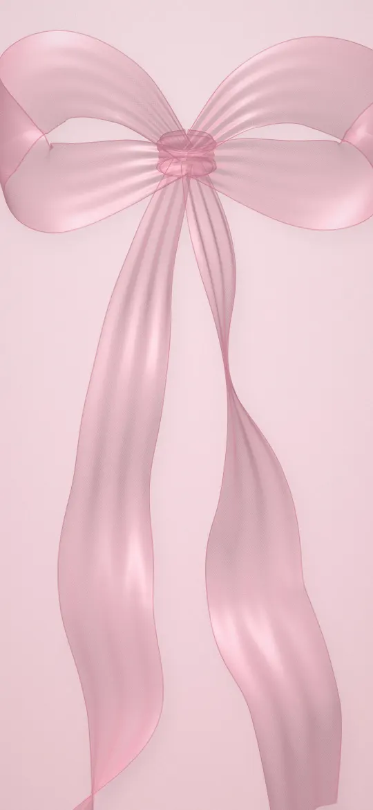
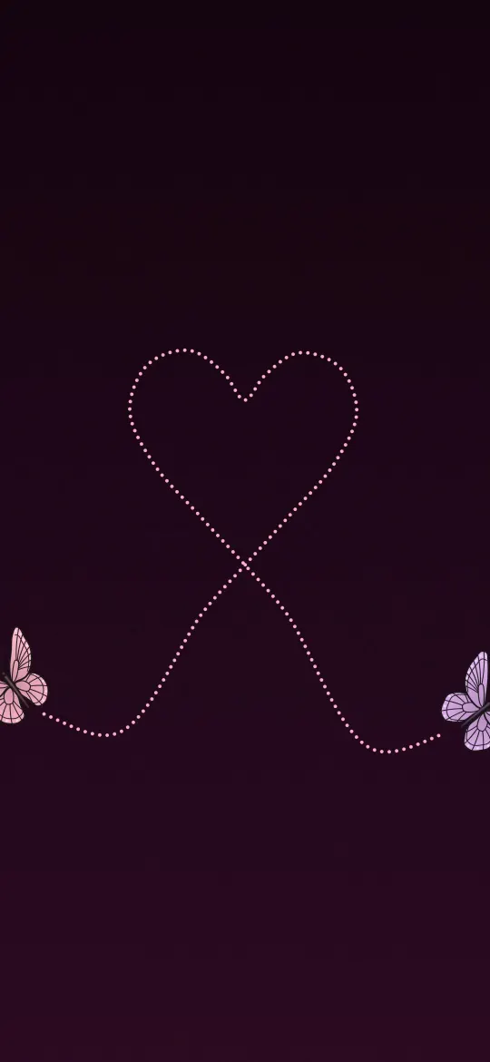
The best Home Screen wallpaper is a calm one: soft gradients, plain textures, blurred photos or dark minimal designs that keep app icons and their labels easy to read. A busy photo that looks great on the Lock Screen often turns into visual noise once 20 or more icons sit on top of it. Here are ideas that work, and the settings that make almost any picture behave better behind your apps.
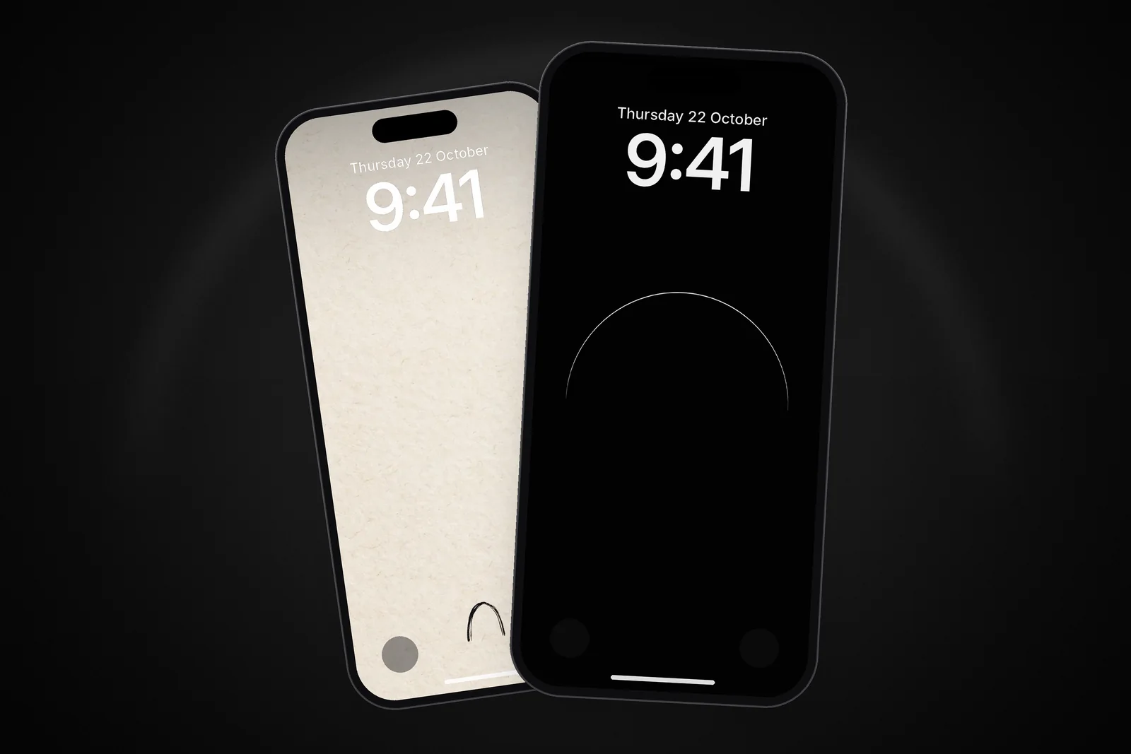
The Lock Screen has a different job: it frames the clock. If that is what you are trying to fix, the guide to a Lock Screen wallpaper that keeps the clock readable covers it. This post is about the screen behind your apps.
In short
- Choose a calm picture: a soft gradient, a paper or stone texture, fog, a dark minimal design or a blurred photo.
- Keep it mid to dark in tone so white app labels stand out, with detail at the edges rather than under the icon grid.
- If a favourite photo is too busy, use Blur on the Home Screen side of the wallpaper pair.
- Finish with the icon style: touch and hold the Home Screen, tap Edit, then Customise to choose Dark, Clear or Tinted icons.
Why the Home Screen needs a different kind of wallpaper
On the Lock Screen, a wallpaper is the main event. On the Home Screen it sits behind a grid of colourful icons, white text labels, the Dock and perhaps a couple of widgets. Every bit of detail in the picture competes with those.
- App labels are small white text. They disappear over bright skies, snow, white flowers and busy patterns.
- Icons are already colourful. A saturated wallpaper makes the whole screen feel loud and slows down finding the app you want.
- The middle of the screen is covered. A subject in the centre of the photo ends up hidden behind icons anyway, so it is wasted there.
That is why the most popular Home Screen setups look simple. The aesthetic is less about the picture and more about leaving room for the apps.
Five Home Screen wallpaper ideas that work
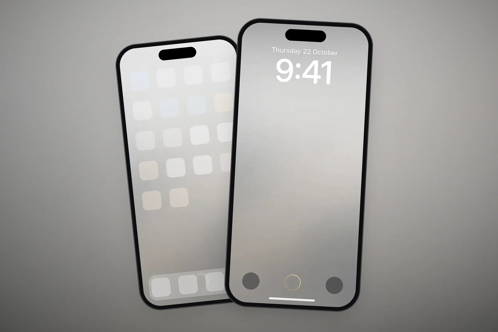
- Soft gradients. A smooth shift between two related colours gives the screen mood without any detail to fight the icons.
- Paper and stone textures. Beige, cream and grey textures add depth but stay low in contrast, so white labels and colourful icons both read well.
- Fog and haze. Misty pictures are naturally soft and mid-toned, which suits icon grids.
- Dark minimal designs. A single thin line or arch on black gives the screen a focal point at the edges and leaves the icon area clean.
- Blurred versions of your Lock Screen photo. You keep the colours of a favourite picture but lose the detail that clutters the grid.
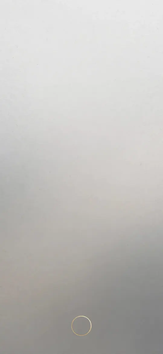 Minimal Zen Gray Gradient
 Minimal Fog
 Wabi Sabi Beige Textured Minimal
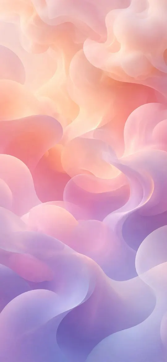 Pastel Gradient Blobs
 Minimalist Arch Curve on Beige Textured Paper
More pictures in this quiet style are collected in the minimal wallpapers category and under the gradient tag.
What makes a picture readable behind app icons
You can judge almost any wallpaper with three quick checks before you set it.
| Check | Works behind icons | Struggles behind icons |
|---|---|---|
| Contrast | Gentle changes in brightness | Sharp black and white edges, high-contrast patterns |
| Brightness | Mid to dark tones, so white labels stand out | White or very bright areas under the label rows |
| Detail | Large calm areas, detail kept to the edges | Leaves, crowds, city lights or text across the whole frame |
| Colour | One or two related colours | Many saturated colours competing with the icons |
A useful test: set the wallpaper, then look at the Home Screen for two seconds and check that you can find your Messages or Camera icon instantly. If your eye lands on the picture first, it is too busy for this screen.
Use blur, dark icons and a matching pair
Blur the Home Screen side
Each iPhone wallpaper is a pair: one picture for the Lock Screen and one for the Home Screen. Long-press the Lock Screen, tap Customise, then choose the Home Screen side. From there you can turn on Blur to soften the same photo, or pick a different photo or a plain colour. You can reach the same options from Settings → Wallpaper.
Blur is the easiest fix for a detailed photo. Colours stay the same, so the two screens still feel connected, but the shapes melt into a smooth backdrop that labels can sit on.
Try dark icons on a dark wallpaper
Recent versions of iOS let you change how icons look: touch and hold the Home Screen background until the icons jiggle, tap Edit, then Customise. Choose Dark (or Auto, for dark at night and light by day), Clear for translucent icons, or Tinted, where an eyedropper can pick a colour straight from your wallpaper. Dark icons on a black or deep-toned wallpaper make a very calm screen, and they pair well with OLED iPhones, where black pixels are switched off. The true black AMOLED wallpapers are a good starting point for this look.
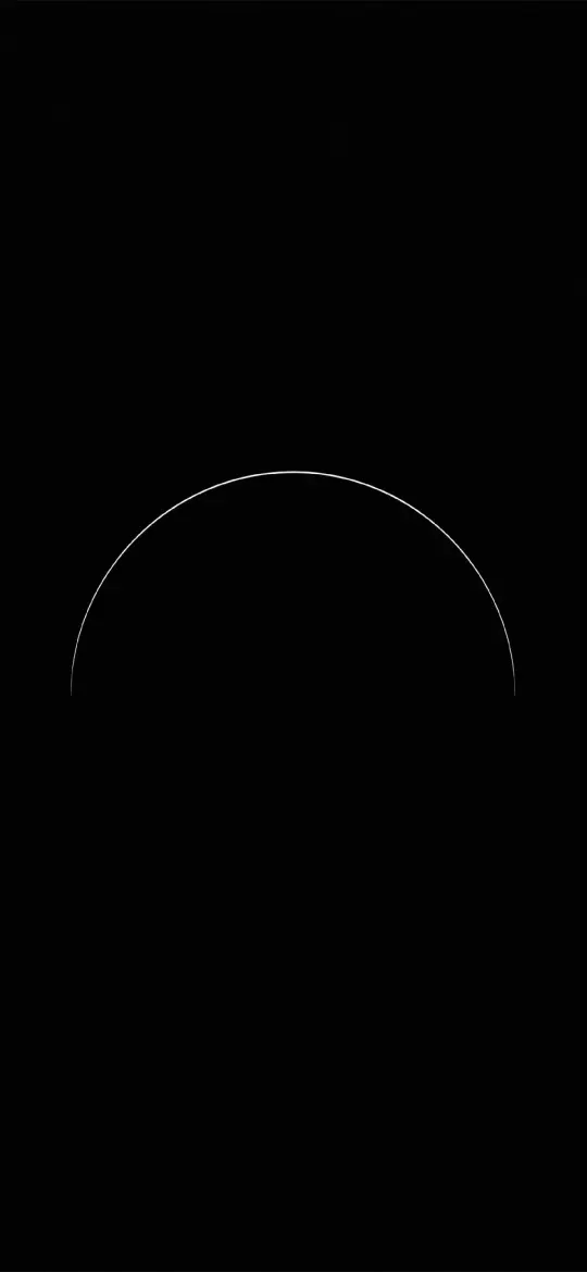 Pure Black OLED Minimal Arch
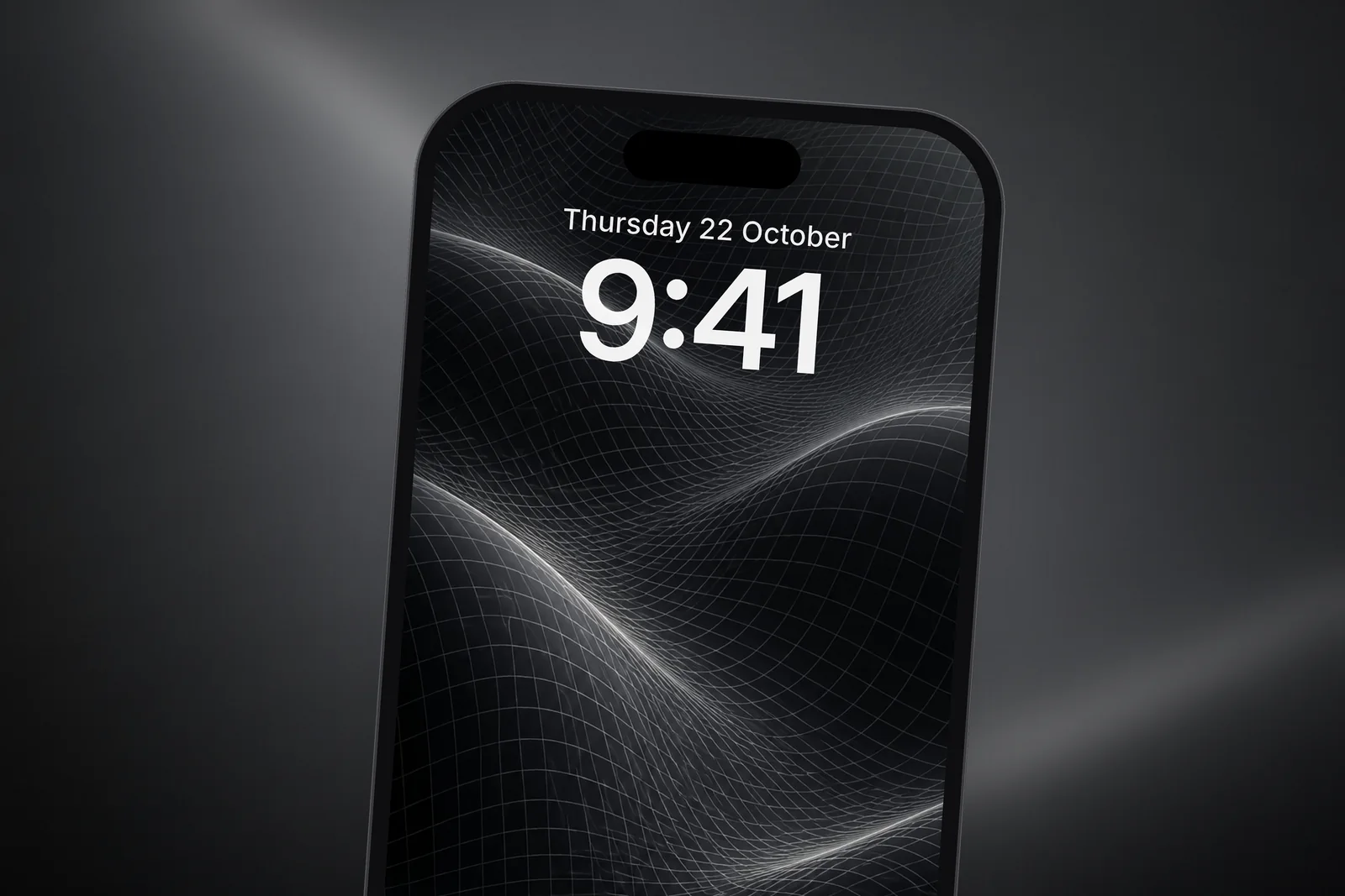
 Dark Wireframe Waves
 Minimal S-Curve Glowing White Line OLED
 Minimalist Glowing Light Orb on Pitch Black
Build a matching Lock and Home pair
The neatest setups use two different but related pictures. Put a scenic or detailed image on the Lock Screen, where nothing covers it, and a quieter picture in the same colours on the Home Screen.
- A moonlit landscape on the Lock Screen with a plain black arch on the Home Screen.
- A golden desert at sunset with a beige paper texture behind your apps.
- A chrome or liquid abstract with a soft gradient in one of its colours.
Get the size right so it stays sharp
A Home Screen wallpaper is shown across the full display, so a small or badly cropped picture looks soft behind crisp icons. Every iPhone wallpaper here is cut to the exact screen sizes of each model, plus a universal 4K file. If you are not sure how to frame it once it is downloaded, the guide to setting a wallpaper on iPhone walks through each step, including pinch to zoom and drag to position.
Read next: Minimalist Wallpaper for iPhone: What Works With Widgets and Do Dark Wallpapers Save Battery on iPhone? The Honest Answer.
Quick answers
What is a good Home Screen wallpaper?
One with large calm areas, soft contrast and mid to dark tones, such as a gradient, a texture, a foggy scene or a dark minimal design. It should let you find apps faster, not slower.
How do I make app icons easier to see on my wallpaper?
Blur the Home Screen side of the wallpaper pair, choose a darker or less detailed picture, or switch to dark icons in the Home Screen Customise menu.
Can the Home Screen have a different wallpaper from the Lock Screen?
Yes. Long-press the Lock Screen, tap Customise, select the Home Screen side and choose a different photo or a colour instead of the paired picture.
What are Clear app icons on iPhone?
Clear is an icon style that makes app icons and widgets translucent, so the wallpaper shows through them. Touch and hold the Home Screen, tap Edit, then Customise, choose Clear and pick Light, Dark or Auto. It looks best on calm, even wallpapers.
Why did the app names disappear from my Home Screen?
You probably switched to large icons in the Customise menu. Apple notes that in the large size the app names disappear; tap the size button again to bring back the smaller icons and their labels.
Sources
- Customize apps and widgets on the iPhone Home Screen, Apple Support
- Change the wallpaper on iPhone, Apple Support