A wallpaper that looks stunning in a gallery can be a mess on a Lock Screen. The clock, the date, widgets and a stack of notifications all sit on top of it. Here are five checks we use when picking Lock Screen wallpapers, with examples from the site, plus the clock settings that rescue a picture that is almost right.
In short
Pick a wallpaper whose top quarter is calm (sky, a gradient or a soft texture), whose tone is the opposite of your clock colour, and whose subject sits in the middle of the screen, clear of the widget row and notifications. Download it at your iPhone's exact size so iOS doesn't zoom a busy area up under the time. If the time is still hard to read, touch and hold the Lock Screen, tap Customise and tap the time to change its colour, font or height.
1. Keep the top quarter calm
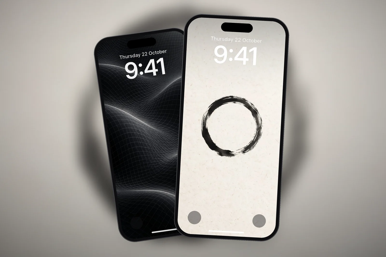
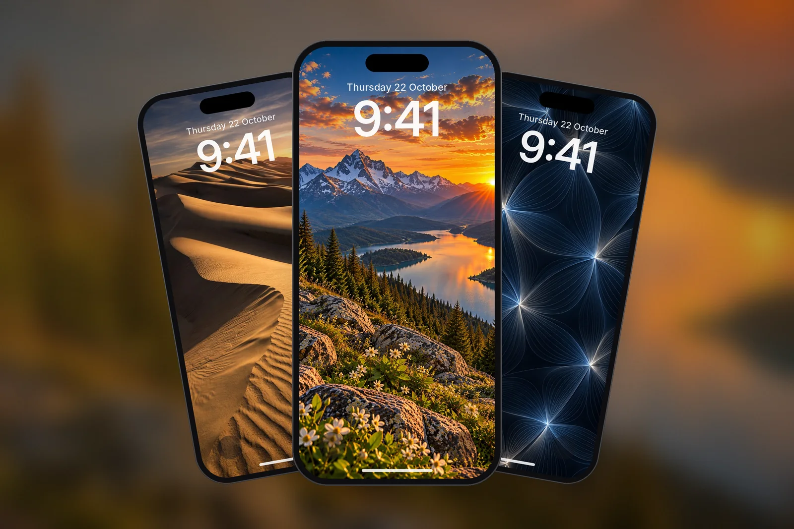
The date and time take up roughly the top quarter of the screen, with the Dynamic Island or notch above them. On an iPhone 17 or iPhone 18 Pro, whose screen is 2622 pixels tall, that is the top 650 pixels or so. Wallpapers with sky, empty space or a soft texture in that band keep the time readable. Busy detail behind the numbers, such as branches, text or city lights, makes them hard to read at a glance.
A quick test before you download: look at the wallpaper as a small thumbnail, or squint at it. If you can still see sharp edges or strong jumps between light and dark in the top band, the clock will fight them on your phone.
 Minimalist Arch Curve on Beige Textured Paper
 Zen Enso Brush Circle on Textured Rice Paper
 Minimal Zen Gray Gradient
 Minimalist Vertical Fine Line on Cream Paper
2. Check the contrast with the clock
A light wallpaper needs a dark clock and the other way round. Apple's design guidelines for app developers use the WCAG contrast levels: at least 4.5:1 for normal-size text and 3:1 for large or bold text. The Lock Screen clock is large, so 3:1 against the area directly behind it is a sensible minimum; the smaller date, widget and notification text needs closer to 4.5:1.
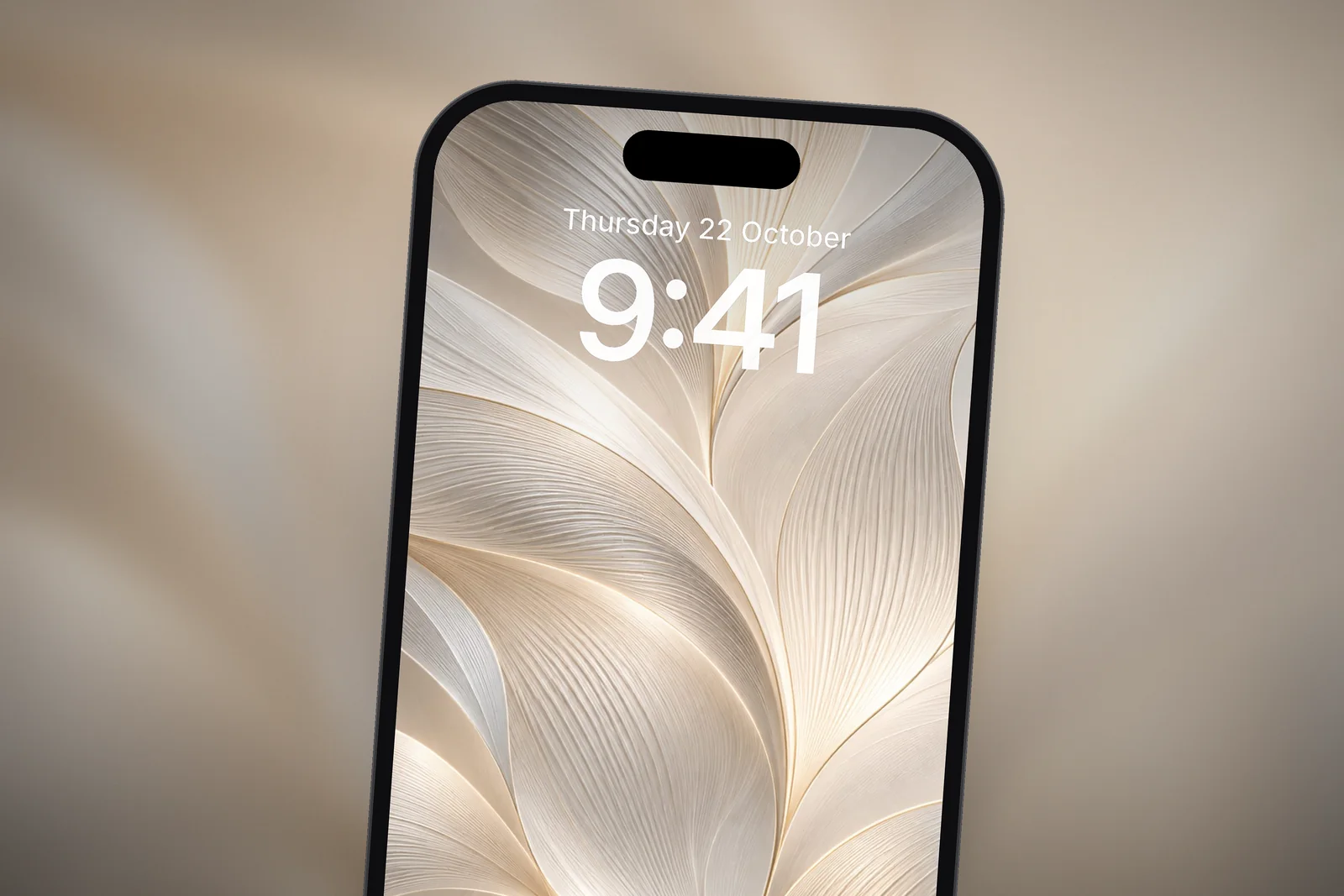
iOS picks a clock colour for you, but you can change it: touch and hold the Lock Screen, tap Customise, then tap the time. From there you can choose a font and colour or switch to a more transparent look, and you can drag the clock's bottom-right corner to make it taller.
| Wallpaper behind the clock | Clock that reads well | Avoid |
|---|---|---|
| Night sky, black or navy | White or a pale tint | Dark tints |
| Cream paper, beige or pastel | Black, charcoal or deep navy | White and pale tints |
| Mid-tone photo (green hills, blue sea) | White in a heavy weight, or a very dark tint | Thin fonts and colours close to the photo |
| Busy pattern or texture | The boldest weight in the strongest contrast | The transparent look |
3. Leave the bottom for notifications
Notifications stack up from the bottom of the Lock Screen. A wallpaper whose main subject sits in the middle of the screen stays visible even when a few notifications arrive. Landscapes with the horizon in the middle work especially well.
The bottom corners also hold the two Lock Screen controls, the torch and camera by default, which you can swap for others in the editor. A bright patch behind them matters less than one behind the clock, because they are icons rather than text, but a plain foreground still looks tidier.
On iPhones with an Always-On display, a dimmed Lock Screen stays visible when the phone is locked, showing the time, notifications and widgets. If a bright wallpaper competes with the dimmed clock, go to Settings → Display & Brightness → Always On Display and turn Show Wallpaper off.
 Mountain Lake Sunset
 Alpine Mountain Lake Reflection & Pine Forest
 Full Moon Over Misty Pine Forest Mountain
 Golden Desert Sand Dunes at Sunset
4. Think about widgets
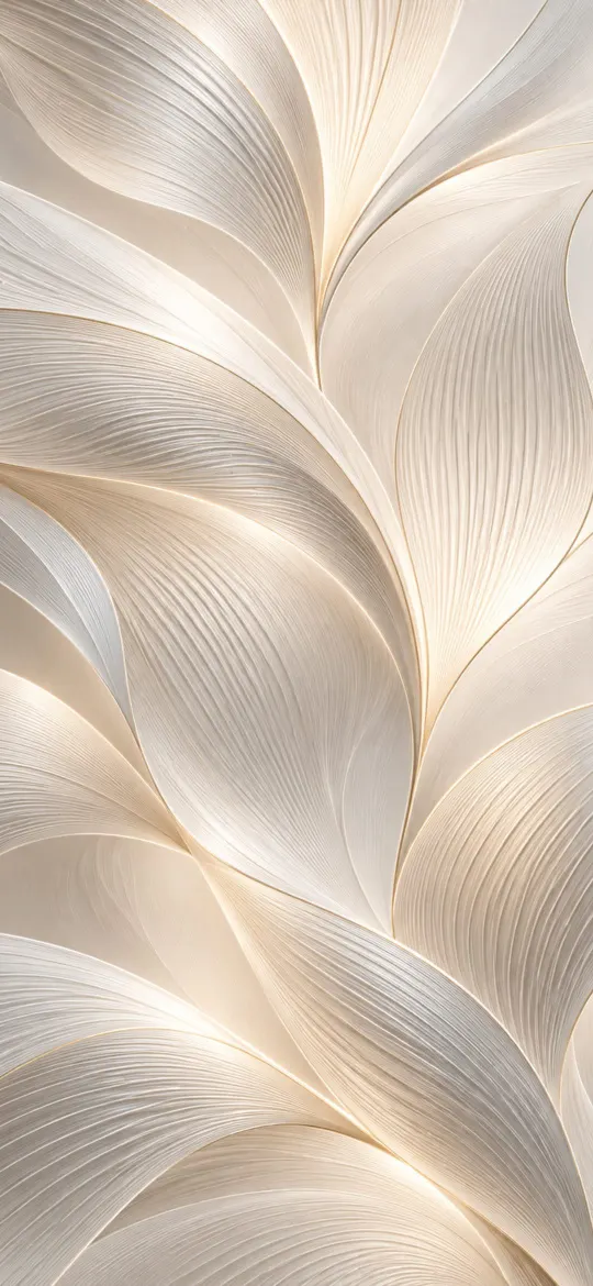
Lock Screen widgets sit just below the clock. Patterns and textures handle them well, because there's no single subject for a widget to cover. If you use several widgets, an even pattern is usually a better choice than a photo.
Widget text is small and tinted to match the clock, so it needs more contrast than the clock itself. A wallpaper that only just works for the time may make a weather or calendar widget unreadable. Our guide to Lock Screen widgets on iPhone explains how many fit and where they go.


5. Use the right size for your iPhone
When a wallpaper's shape doesn't match your screen, iOS zooms it to fill the display. That can push the subject up under the clock or off the edge. Downloading the version cut for your exact model avoids that; our iPhone wallpaper size chart lists every resolution. The most common current sizes are:
- iPhone 17 and iPhone 18 Pro (also 17 Pro and 16 Pro): 1206 × 2622
- iPhone 18 Pro Max (also 17 Pro Max and 16 Pro Max): 1320 × 2868
- iPhone Air: 1260 × 2736
- iPhone 17e (also 16e, 14 and 13): 1170 × 2532
- Any iPhone: the universal 2160 × 3840 file
What if the subject still reaches the clock?
iOS 27 has two tools for pictures where the subject rises into the clock area. Depth Effect layers a clearly outlined subject, such as a mountain ridge or a person, in front of the time: in the editor, tap the Depth Effect button, or on photos that support layering tap the … button and choose Depth Effect. On iPhone 12 and later, Apple also offers options where the time adapts to your photo wallpaper and notifications.
Both work best when the subject has a clean edge against plain sky. If the subject is busy or soft, drag the picture down with two fingers instead so the clock sits on sky. Our Depth Effect guide covers the common reasons the effect won't switch on.
For step-by-step instructions, see how to set a wallpaper on iPhone.
Quick answers
What colour should my iPhone Lock Screen clock be?
The opposite tone to the wallpaper behind it: white or a pale tint on dark pictures, black or deep navy on light ones. A colour picked from the wallpaper works only if it still stands out by about 3:1.
How do I change the clock font and colour on iPhone?
Touch and hold the Lock Screen, tap Customise, choose the Lock Screen and tap the time. Pick a font and colour, or the more transparent look, then tap Done.
Can I make the Lock Screen clock bigger?
Yes. In the Lock Screen editor, drag the bottom-right corner of the clock to increase its height. A taller clock stays readable on busier wallpapers.
Why is the clock hard to read on my wallpaper?
Usually there is busy detail or a similar tone right behind the digits, or iOS zoomed a wrongly sized image so a busy area moved up. Download your exact size, drag the picture down or change the clock colour.
Does the clock stay readable on the Always-On display?
It dims along with the wallpaper. If a bright picture makes the dimmed time hard to see, turn off Show Wallpaper in Settings → Display & Brightness → Always On Display.
Sources
- Create a custom iPhone Lock Screen (iOS 27), Apple Support
- Keep the iPhone display on longer (iOS 27), Apple Support
- Accessibility, Human Interface Guidelines, Apple Developer
- iPhone 18 Pro and 18 Pro Max – Technical Specifications, Apple